

In today’s competitive business landscape, where business-critical projects are crucial for the sustainable progress of an organization, and in this regard, metrics are critical for measuring and tracking the progress of the project. On many occasions, you have been part of a project where there was no tracking of data and it was difficult for a project manager to tell whether the team was on course for release or where they were efficient as they got along with their job. On a few occasions, there was data tracked all along and were used as weapons to justify more work was mandatory. Therefore, there is a love/hate relationship when it comes to metrics with regard to project delivery.
Metrics in Agile do not have to be this way. Tracking and sharing Agile metrics, will reduce confusion and provide you with an overview of the team’s progress and setbacks along the project lifecycle.
Understand the Business Objective:
“Project Completion” gives you only half of the picture. It is more about building the right software/product, at the right time, for a particular market. To stay on track throughout the project lifecycle means collecting data at crucial junctures and analyzing the same. In fact, in any Agile project, it is of utmost importance to track and validate both business metrics and Agile metrics. Usually, business metrics focuses on whether the product is meeting the market demands, and Agile metrics is all about measuring the critical aspects of the development process.
Every project/program initiative on the roadmap will have different key performance indicators (KPIs) that map to the project’s goals. Addition, in addition, there will be a few success criteria for each of the product requirements that include the adoption rate by the users and the percentage of code completed by automated / manual tests. Moreover, all these success criteria are used in the project’s Agile metrics. With this, the teams will learn more and they will be better equipped to adapt and evolve along the project lifecycle.
Top 5 Agile Metrics Used to Optimize Project Delivery:
Agile metrics discussed below focus on the delivery of software. Irrespective of the team that you belong to scrum or Kanban, these Agile metrics will help the team to get a comprehensive understanding of the development process and make the release that much easier.
1. Sprint Burndown Metric:
Scrum teams work on development through various sprints. At the beginning of the sprint, the team will determine the amount of work to happen in a particular sprint. A sprint burndown metric will help to track the completion of work from the sprint. The below-mentioned diagram will give you a clear idea of how the forecasted work will be completed within the sprint.
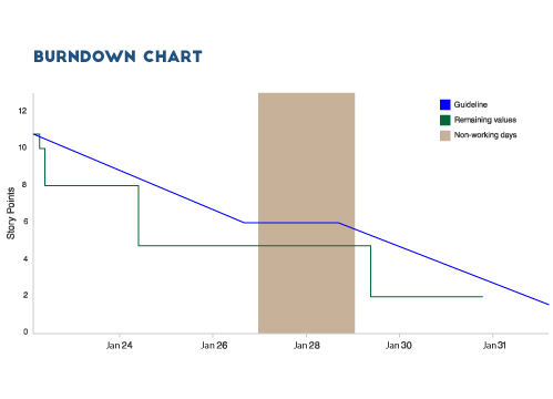
A scrum or a Kanban team that regularly meets its forecast gives a clear endorsement of organization’s ability in Agile projects / programs. This sprint burndown report tracks the completion of work all along the sprint and is one of the common Agile metrics used.
You also need to look out for some of the potential anti-patterns in the form of:
-
- The team finishes the work early after each sprint because they are not committing enough work in the first place
- The team misses their forecast at every sprint because they are committing to a lot of work
- The burndown line has steep drops than gradual burndown as the work has not been broken down into granular pieces
- There is a change in the scope mid-sprint
2. Epic and Release Burndown Metric:
The epic and release (or version) burndown charts track the progress made about development with a large quantity of work than the sprint burndown. Because sprints contain work from various epics and versions, it is of paramount importance to track the progress of both individual sprints along with epics and versions.
Scope creep usually happens in epics and versions than in sprints; if it is happening during sprints, then that is a bad practice. As the team goes ahead in the project lifecycle, the project manager may add or remove work depending on what the team is learning. The epic and version burndown charts will keep everyone in tune with the flow of work inside the epics and versions.
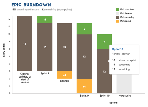
You also need to look out for some of the potential anti-patterns in the form of:
-
- Failure to update epic/release forecasts on a regular basis
- It is little or no progress made even after several iterations
- Persistent scope creep – meaning the product owner has failed to understand the problem
- The scope keeps on growing irrespective of whether the team can absorb it
- The team is unable to deliver incremental releases throughout the development of epic
3. Team Velocity:
Velocity in Agile terms means the average amount of work a team can complete in a sprint, it can be measured either in the form of story points or hours and is very useful for forecasting. The project manager or the product owner can use this velocity and determine how quickly the team can work through backlogs, as the velocity report tracks the forecasted and completed work over several iterations.
For instance, the product owner wants to complete 400 story points in the backlog. Through the velocity metric, one can assume that the team usually completes 40 story points in a single iteration. Hence, the product owner can assume that the team may need close to 10 iterations to complete the backlog.
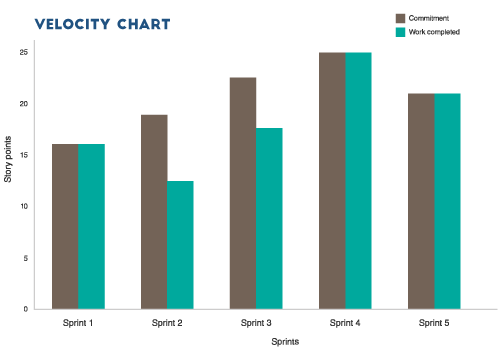
You also need to look out for some of the potential anti-patterns in the form of:
Velocity is erratic for a long period, get a grip on the team’s estimation practices, and address the same in the retrospective meeting by asking a few important questions as –
-
- Is there an inherent business pressure stretching the team beyond its limits?
- Were there any unforeseen challenges, which we did not account for while estimating?
- Are we being overly optimistic while forecasting for the sprint? The last thing that you would want to do is compare different teams and their velocity. Each team is unique and so is their velocity. For example, if team A has a velocity of 40 and team B has 60; it does not mean that team B has higher output. Every team has a unique estimation culture and their velocity will be as well. Measure the team’s velocity by determining the effort and output and their representation of story points.
4. Using Control Charts:
In Agile development control charts are used to determine the cycle time of issues – from “work in progress” to “completed” status. Agile teams that have shorter cycle times will have greater output, and teams with cycle times that are consistent will have predictable work delivery.
Measuring these cycle times is one way to improve team’s work processes as changes are visible almost immediately, which will help the team to make tweaks right away. The end objective is to have a consistent and short cycle time, irrespective of the type of work.
You also need to look out for some of the potential anti-patterns in the form of:
You may find control charts to be irregular at first. Nevertheless, you have to look for trends and two main areas to watch out for –
-
- Increasing cycle time: If there is an increase in cycle time, it totally undermines the team from its hard-earned agility. During the retrospective meeting, try to understand the increase. There is one exception though, where the team’s definition of “completed” has expanded, so the cycle time will also expand.
- Erratic cycle time: As a product owner, if you are finding inconsistent cycle times for similar story points (be it small or large) then spend time in retrospect to examine the root cause and improve future estimations.
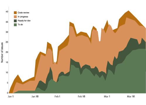
5. Cumulative Flow Diagram:
This cumulative flow diagram is a more critical resource for Kanban teams than for scrum teams. This diagram will help to make sure the flow of work across the team is uniform. In the below diagram, the number of issues is on the Y axis and time is on X axis, and different colors indicate various workflow states where it points out shortages and bottlenecks with regards to “work in progress” limits.
The whole diagram should look smooth from left to right. If there are any gaps or bubbles in any of the colors, then it represents bottlenecks and shortages. So look for ways to smooth out the color bands in the chart.
You also need to look out for some of the potential anti-patterns in the form of:
-
- By blocking issues, it creates large backups in some parts and nothing in others
- Backlog growth that is unattended. This usually happens when product owners do not close out issues that are out of date or of low priority.
All these metrics along with Agile project management help to build a team’s culture. They give the right insights into a team’s performance and help them with providing measurable goals. However, do not get obsessed with metrics; listening to your team during retrospectives is equally important to understand real-world problems. This builds trust and helps the team to achieve better quality and be more productive over sprints, epics, and versions during the project delivery.


?")


