

In project management, the universal time constraint holds particular significance, especially within the dynamic landscape of Agile projects. Every industry, irrespective of its specific demands, has the challenges of evolving project scopes and timelines.
This is where the Agile Burndown Chart comes into play – a fundamental tool for project management teams operating in the Agile methodologies.
This blog post explains how to use an Agile Burndown Chart to monitor project progress. It tracks completed tasks, pending work, and the remaining timeline.
Take this journey with us as we navigate the intricacies of the Agile Burndown Chart, offering insights into its crucial role and guiding principles for its efficient application in dynamic project environments.
Table of Contents
- What is a Burndown Chart?
- Components of a Burndown Chart
- Burndown Chart vs. Burnup Chart
- How to Read a Burndown Chart?
- Using Burndown Chart in Agile and Scrum Projects
- The Benefits of a Burndown Chart
- What are the Limitations of a Burndown Chart?
- Conclusion
What is a Burndown Chart?
A Burndown Chart is a dynamic visualization tool that provides a real-time snapshot of your team’s progress in Agile projects, offering a user-centric perspective on completing tasks over time.
This chart is a valuable asset in tracking and managing work, focusing on the end user’s experience and updating only after the successful closure of user stories.
In the Agile landscape, there are two primary types of Burndown Charts – Product Burndown Charts and Sprint Burndown Charts.
Product Burndown Charts:
Product Burndown Charts visualize the project’s journey from inception to completion, using sprint numbers on the horizontal axis to show achieved goals and the remaining workload in story points on the vertical axis.
Sprint Burndown Charts:
Sprint Burndown Charts focus on ongoing sprints, displaying selected user stories and emphasizing immediate goals. The horizontal axis, marked by days, enables a detailed daily analysis of the team’s sprint performance.
Agile teams often combine Product and Sprint Burndown Charts for a holistic view of performance, prominently displaying them to enhance transparency and keep everyone informed. This practice fosters improved communication, better decision-making, and a stronger commitment to project success.
Components of a Burndown Chart
The Burndown Chart comprises various essential components for a comprehensive project overview. Its axes, representing time or iterations (horizontal) and user story points (vertical), create a visual roadmap.
The chart’s starting point on the leftmost side, also the apex of the ideal burndown chart, marks the project’s initiation, while the rightmost point signifies the project or sprint’s conclusion.
A distinctive feature often seen is the ideal work remaining line, either dotted or using a different color, and past team performance to estimate future progress. This line is a benchmark for assessing performance, characterized by a constant slope despite the team’s varying velocities throughout the project.
The actual work line on the Burndown Chart depicts real-time project progress, sharing the same origin as the ideal line. Occur as the actual line rises above or below the ideal line, signaling the project’s status.
An actual line above the ideal indicates a lag, while a line below suggests the project is ahead of schedule, providing valuable insights into project performance.
Burndown Chart vs. Burnup Chart
In the Agile project management toolkit, the Burndown Chart and Burnup Chart play pivotal roles, each offering distinct insights – one tracking diminishing work, the other highlighting cumulative accomplishments.
This table briefly compares their features, emphasizing when and how teams can leverage these visualization tools for optimal project management.
| Feature | Burndown Chart | Burnup Chart |
| Focus | Primarily on work remaining or backlog | Primarily on work completed or delivered |
| Representation | Displays a downward-sloping line | Displays an upward-sloping line |
| Usage | Assessing progress toward completing all work | Tracking and communicating overall progress |
| Key Emphasis | Reduction in remaining work over time | Cumulative work completed over time |
| Goal | Reaching zero remaining work by the end | Showcasing overall progress and accomplishments |
| Insights | Highlights deviations from the ideal path | Offers a positive perspective on achievements |
| Motivation | Emphasizes meeting project goals | Motivates the team by showcasing completed work |
Both charts use similar metrics but offer different perspectives, with the Burndown Chart focused on remaining work and the Burnup Chart emphasizing completed work. Using both charts can provide a comprehensive view of project dynamics.
How to Read a Burndown Chart?
The Burndown Chart encompasses various elements. It features an x-axis representing the project or sprint timeline, while the y-axis denotes the remaining work measured in story point estimates.
This axis signifies the projected workload yet to be completed. The project’s initiation is at the farthest left point on day zero, and its conclusion is at the farthest right, marking the final day of the project or iteration.
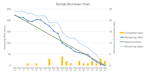
Source: Wikipedia
The chart includes an Ideal Work Remaining Line—a straight connection between the starting and ending points. This line reflects the cumulative estimates for all tasks, representing the project’s scope.
The ideal line intersects the x-axis at the endpoint, indicating no remaining work. However, it’s important to note that this line is based on estimates and may not always be accurate.
Contrastingly, the Actual Work Remaining Line illustrates real-time work remaining in the project or iteration. Initially aligning with the ideal line during the project execution phase, it fluctuates above and below as the project progresses.
Daily updates ensure accuracy, with deviations indicating potential schedule variations. If the actual line reaches the ideal, it suggests more work than initially estimated, signifying a project is behind schedule.
Conversely, if the actual line is below the ideal, it indicates less work than predicted, signifying a project ahead of schedule.
Using Burndown Chart in Agile and Scrum Projects
The Burndown Chart is a valuable tool in Agile and Scrum projects, providing a visual representation of work progress over time.
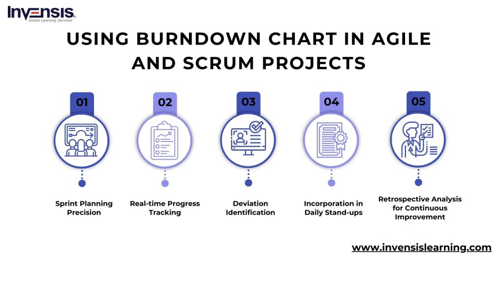
Here’s how to effectively use a Burndown Chart in Agile and Scrum contexts:
-
Sprint Planning Precision
Use the Burndown Chart during sprint planning to allocate story points accurately and establish realistic sprint goals. The chart aids in understanding the team’s capacity and ensures a balanced workload for each iteration.
-
Real-time Progress Tracking
Regularly update the Burndown Chart to visually track real-time progress. This dynamic tool allows teams and stakeholders to quickly evaluate whether they are meeting sprint or project goals, fostering transparency and informed decision-making.
-
Deviation Identification
Monitor the Burndown Chart daily to identify deviations between the ideal and actual lines. Early detection of differences enables the team to address issues promptly, ensuring that the project stays on course.
-
Incorporation in Daily Stand-ups
Integrate the Burndown Chart into daily stand-up meetings to facilitate discussions on progress. By using the chart as a reference point, team members can provide updates, discuss remaining tasks, and collaboratively address conditions.
-
Retrospective Analysis for Continuous Improvement
Analyze the Burndown Chart during sprint retrospectives to identify patterns and trends. This retrospective analysis is a foundation for continuous improvement, allowing the team to make informed adjustments for enhanced performance in subsequent sprints.
By strategically employing the Burndown Chart in these ways, Agile and Scrum teams can optimize their project management processes, enhance communication, and achieve more successful project outcomes.
The Benefits of a Burndown Chart
The key strength of the Burndown Chart lies in its simplicity and adaptability, making it an invaluable tool for project management. Even in less-than-ideal project situations, the chart provides comprehensive information, allowing quick assessments of progress.
Its ability to offer a direct comparison between planned and actual progress enables immediate identification of deviations from the project plan.
The visual representation offered by Burndown Charts significantly contributes to fostering effective collaboration within project teams. Maintaining open communication and keeping everyone aligned with project goals is crucial for managers.
Burndown charts are concise status reports that provide quick updates and easy interpretation and keep all team members informed.
Beyond its project management utility, a Burndown Chart is an excellent motivational tool for team members. The constant visual comparison of actual performance against the ideal on the graph encourages consistent effort.
In Agile workplaces, the Burndown Chart is often significant, occupying a central position in a project. It helps keep everyone updated, focused on tasks, and aligned with the project objectives.
What are the Limitations of a Burndown Chart?
The Burndown Chart, while valuable, has its limitations. It provides a focused view, showing only the completed story points, which may not capture changes in the scope of work or variations in story points due to shifts in backlog items.
This lack of distinction makes it challenging to determine whether changes in the chart result from completed tasks, alterations in scope, or adjustments in story points.
Additionally, neither Burndown nor Burnup Charts offer insights into specific completed product backlog items. While these charts illustrate progress trends, they may not convey whether the team is addressing the most crucial tasks.
Their primary function is highlighting trends rather than ensuring alignment with delivering the right product backlog items.
Conclusion
The Agile Burndown Chart proves to be an essential tool in Agile project management, offering a dynamic visual representation of progress and an understanding of team performance.
By following the insights and strategies outlined in this blog, teams can control the power of the Burndown Chart to enhance transparency, make informed decisions, and ultimately achieve success in their Agile projects.
As a dynamic and adaptable tool, the Agile Burndown Chart aligns with Agile methodologies’ iterative and collaborative nature, empowering teams to navigate challenges, optimize performance, and deliver outstanding results.
Empower your career with Invensis Learning’s Agile Certification courses. Acquire the skills to lead Agile projects effectively, enhance collaboration, and achieve project success. Enroll today for a transformative learning experience.

 Guide: Steps and Best Practices")


